Captured Oct 2026

Why it works
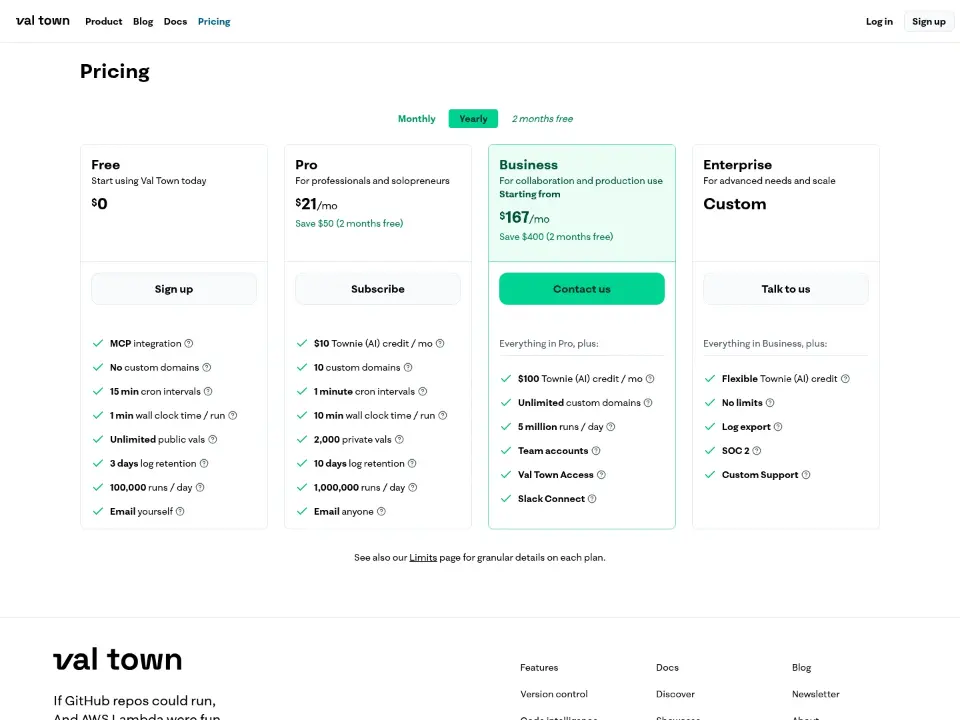
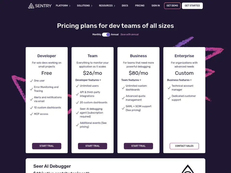
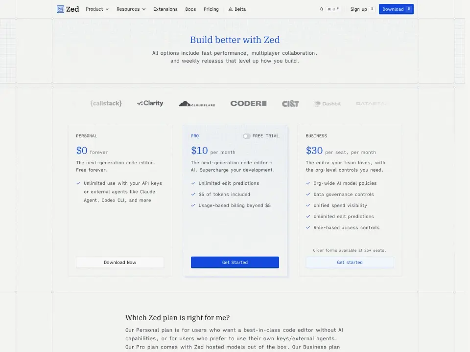
Inter text on black sets a developer-focused tone, with white used for the headline and surface for cards. A single full-width image anchors the hero, and the pricing table sits after the logos, so the value proposition precedes the cost.