Captured Oct 2026
Why it works
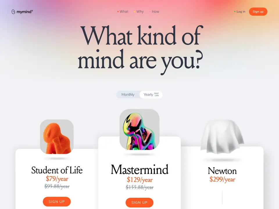
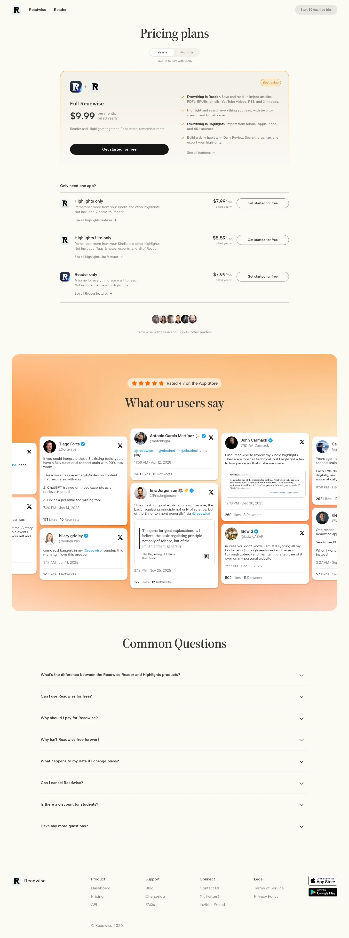
Source Serif 4 headlines on an off-white background provide a literary feel for a reading tool. Sky blue is used sparingly for the toggle and primary buttons, while 16px rounded corners on the pricing cards and buttons soften the layout rhythm.